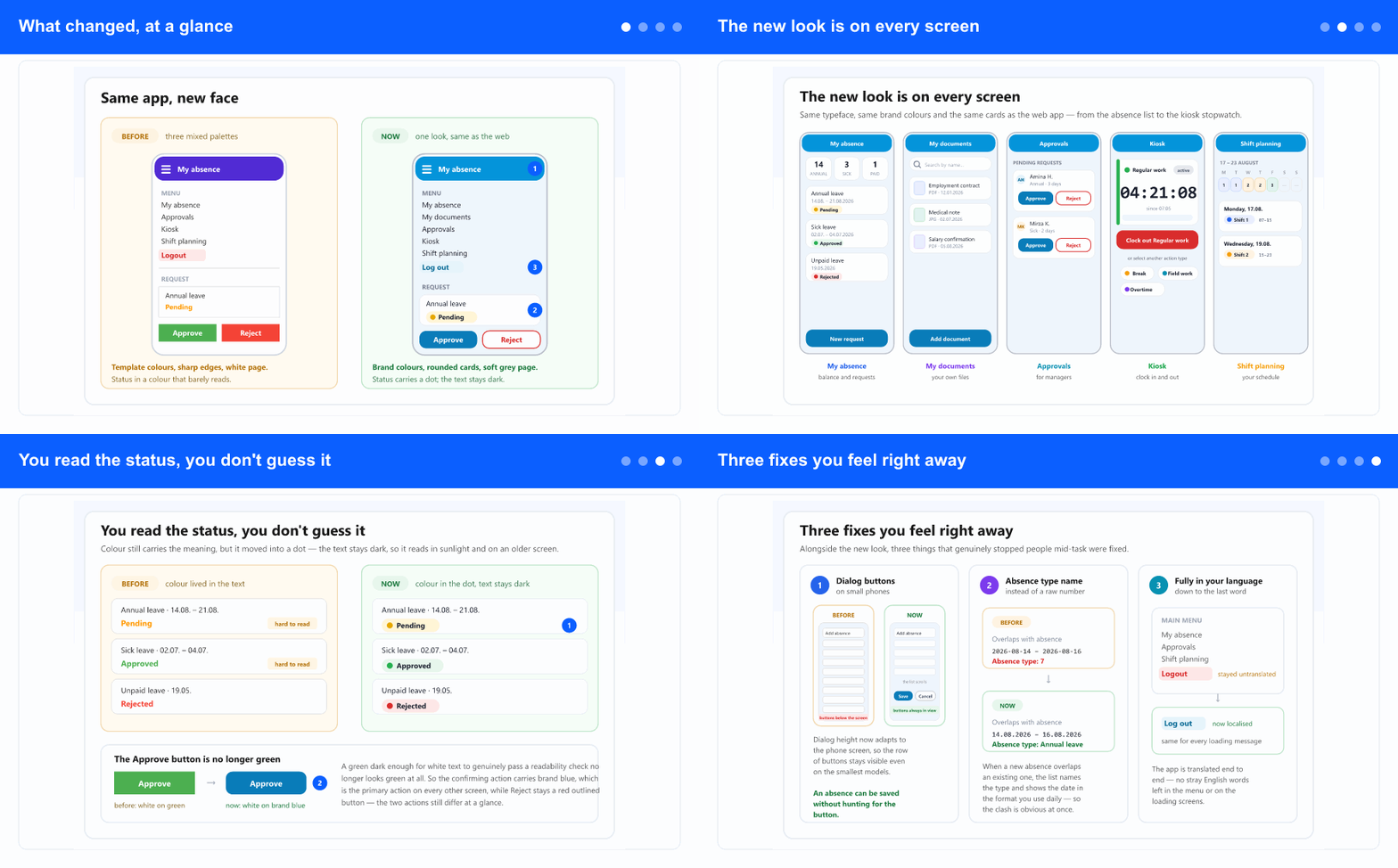
What changed, at a glance
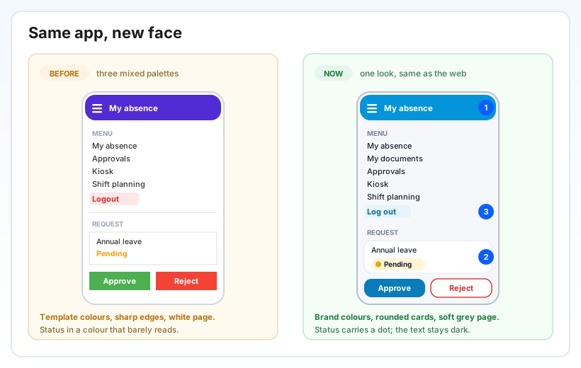
Until now the app carried colours from a development template — a purple bar at the top and three different palettes mixed across screens. Nothing was broken, but the phone looked like another company's product next to the web app everyone already knows.
Now the colours, typeface and card shapes come straight from the web app. The top bar is brand blue, content sits in white cards on a soft grey page, and text uses the same typeface as on the computer. Everything is also slightly larger: the text sizes are deliberately one step above the web values, because what reads comfortably on a monitor is simply too small on a phone.
The app now always runs in its light look, regardless of whether your phone is in dark mode. Previously dark mode switched it to colours nobody had reviewed, so the same screen looked different for two people.
The new look is on every screen
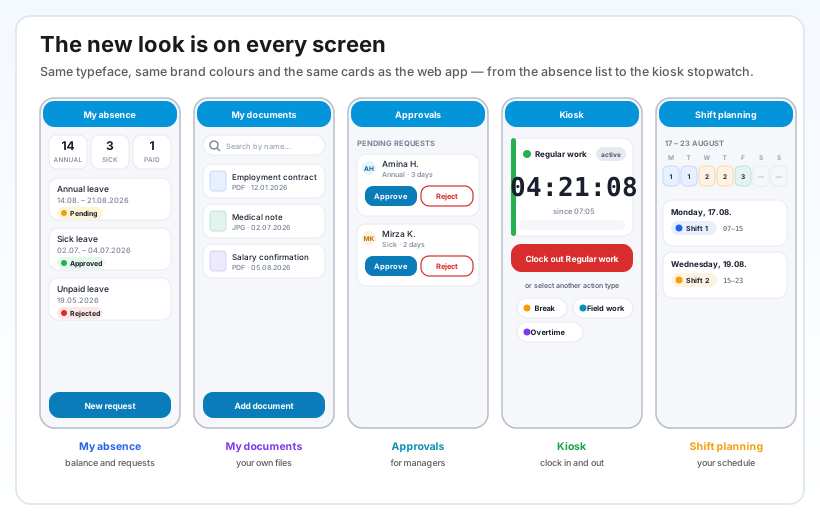
The change was not applied only to the landing screen — it went through the whole app, screen by screen. The absence list, the new-request form, approvals, the kiosk, shift planning and every alert dialog carry the same look, so there is no sense of having "walked into an older part of the app".
One detail you only notice in use: numbers now sit in a typeface where every digit has the same width. On the kiosk that means the stopwatch ticks steadily — until now the whole number jumped left and right with every passing second, because the digits had different widths.
Buttons also got a large enough area for a fingertip, so you hit the neighbouring action less often — which on a building site, in gloves or in a vehicle is not a small thing.
You read the status, you don't guess it
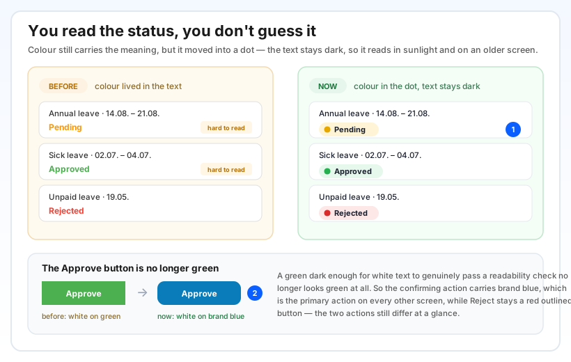
The absence status — Pending, Approved, Rejected — used to be printed in the colour of its meaning. That sounds logical, but a yellow or green word on a white background simply doesn't read well in sunlight, on an older screen or through glasses. The worst case was exactly the state people look at most: Pending.
Now the status is a badge: a coloured dot carries the meaning, and the text is always dark on a soft tint of the same colour. It is recognised just as fast by colour, but it also reads without effort. The same pattern runs through every screen where a status appears — the absence list, request details and approvals.
On top of that, the Approve button moved from green to brand blue. A green dark enough for white text to sit well on it no longer looks green at all, so the confirming action now carries the same blue that is the primary action on every other screen. Reject stayed a red outlined button — the two actions still differ at a glance and still cannot be confused.
Three fixes you feel right away
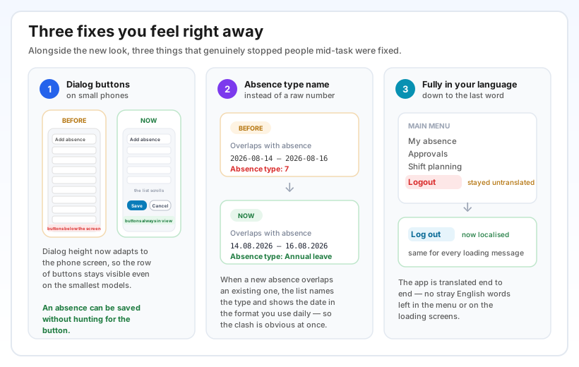
Shift planning dialogs no longer cut off their buttons. On smaller phones the add-absence dialog was taller than the screen, so the row with Save and Cancel ended up below the visible area — the action simply could not be finished. The dialog height now adapts to the screen and the content scrolls inside it.
Overlapping absences now name the type. When a new request falls on days you already have an absence, the app still says so — but instead of Absence type: 7 it says Absence type: Annual leave, and the dates read 14.08.2026 instead of a technical format. Instead of asking "what is seven?", you see at once which absence is in the way.
The app is translated down to the last word. The stray English words left in the menu and on loading screens are translated — Logout is now Log out. If you work in Bosnian, the app no longer slips into English anywhere.
Why it helps
Less explaining during onboarding. When the phone looks like the web app, a new employee doesn't learn two systems. What is a card on the computer is the same card on the phone — in the same colours, with the same meaning.
Fewer wrong taps. A readable status and a clear difference between the confirming and the rejecting action mean a manager comes back to correct an approval less often. Buttons that don't get cut off mean an absence request goes through on the first try.
An app you are happy to show. For management this is also a question of how serious the tool in people's hands looks — for most employees the phone is their only contact with the system.