Reports overview
Added
Three reports are available. They all show employees' presence on company premises, but group the data differently — pick the one that matches the question you're trying to answer.
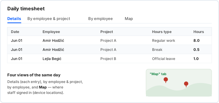
1. Daily timesheet — detailed
The most detailed view, organised into four views of the same day: Details (each individual entry), By employee & project, By employee, and Map — where employees signed in (device locations). With filters by employee, project and hours type, plus Excel export. Use it when you want to look into the detail of a single day.
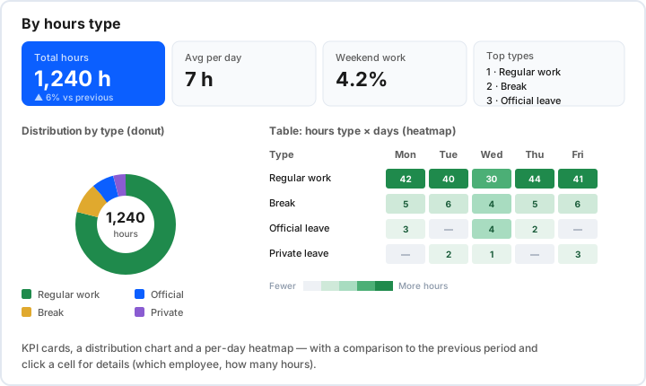
2. By hours type
An analytical view that groups hours by activity type — regular work, break, official and private leave. At the top are KPI cards (total hours, average per day, weekend work, top types), then a distribution chart (donut) and a per-day heatmap (hours type × day). All with a comparison to the previous period and click a cell for details (which employee, how many hours). Use it for a quick picture of where time went.
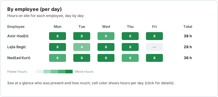
3. By employee (per day)
A people-focused view, shown as a heatmap: each row is an employee, each column a day, and the cell shows the hours for that day (plus the period total). Cell colour instantly shows who was present and how much; weekends are marked separately, and clicking a cell opens the day's details. Use it for tracking and payroll per employee.